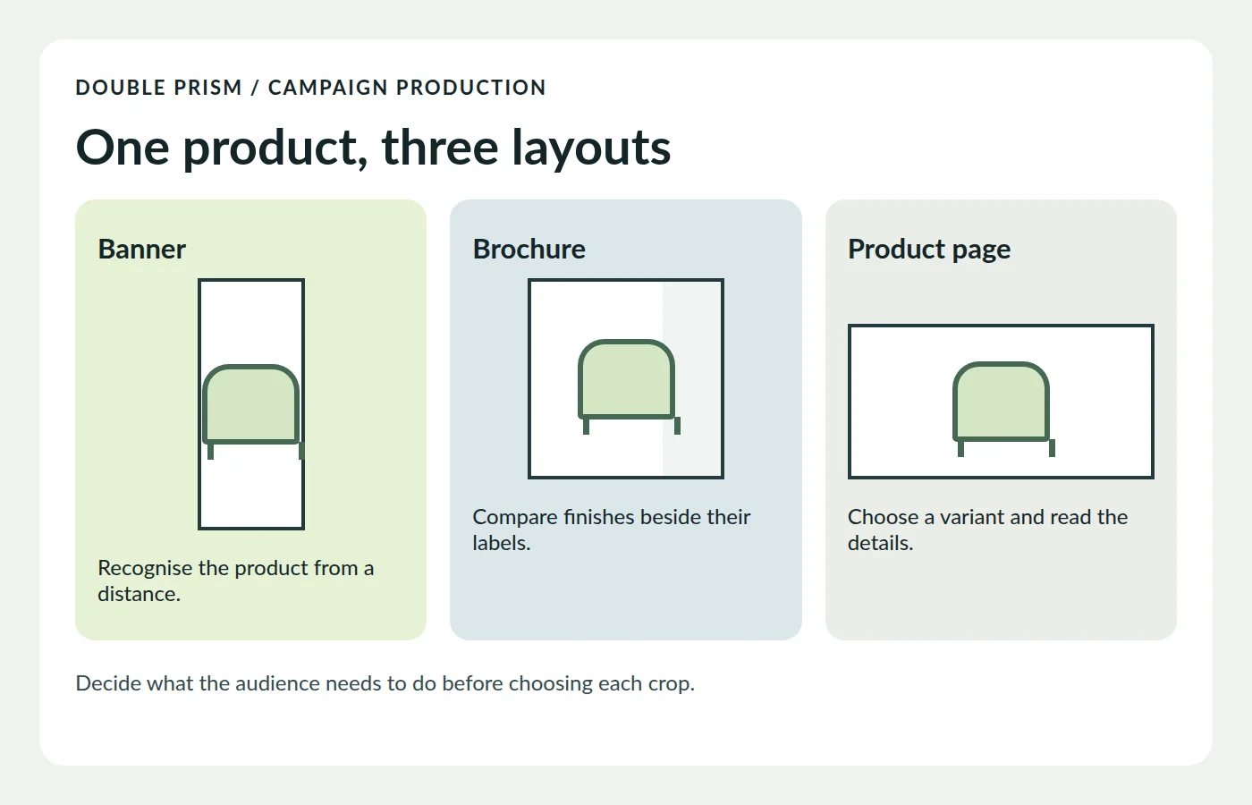
A furniture maker needs a counter brochure, an exhibition banner and an image for the product page. All three can start with the same visualisation. They need different crops, information and approvals. Build an approved product image first, then plan what each reader should recognise or do at the point where they see it.
The archived Double Prism offer listed catalogues, brochures, posters, roll-ups, packaging and digital graphics alongside smaller items such as business cards and stationery. Its description discussed format, finish and paper. This guide develops that idea into a production brief for print and screen. The furniture launch below is an example. The archive does not provide the production files for the studio’s sample work.
Separate the three decisions the campaign needs to support
Exhibition banner. Someone walking past needs to recognise what is being shown and where to go for details. A large product silhouette and a short identifying line can do that. Before cutting a crop, ask for the size of the visible area once the banner is installed. Some of the supplied print size may be hidden in the hardware.
Counter brochure. A reader can hold it close and compare two finishes. Give each variant its own name, image and useful specification. Plan the order in which panels are opened. Check the printer’s fold and panel layout before placing a caption across two panels. Each finish should still have a clear label when a single panel is visible.
Product page. A visitor can zoom, switch variants or follow a link. Start with a legible crop and put important specifications in the page text. This makes them available even when an image is slow to load. If a product image shows a detail the reader needs, describe that detail in its text alternative. Decorative repeats can use an empty alternative. The website planning summary explains how to test the task on smaller screens.
Approve the object before preparing each layout
Lock the version of the object, the finish names and the angles that identify each variant. Try the narrowest and widest crops early. In the example, a side view shows the profile of a chair but hides the material change on its back. A rear three-quarter view makes that distinction visible. If both sides matter, request a second view at the brief stage while the scene is still editable.
For render approvals, distinguish the finish decision from the lighting decision. A warmer scene can make a neutral cloth look more yellow in the image. Compare the variants under matching conditions and use a physical swatch if the job depends on an accurate match. The guide to reusing a product model explains how to keep the version that appears in a campaign traceable.
Ask for a print specification before setting up the file
For each printed item, confirm the finished size, visible area, bleed, safe area and any fold or cutting guides with the supplier. Bleed is the extra artwork beyond the trim edge that allows a background to extend to the edge after cutting. Important names, logos and information belong inside the supplier’s safe area. If a brochure contains a photo that runs across a fold, check the fold position in the printer’s template as well.
Agree on the required PDF export and colour settings with the printer. For a large image, judge its pixel dimensions at the size it will actually occupy. A cropped panel may use a much smaller part of the source render. The resolution and crop guide explains how physical size and image pixels fit together. Review a proof where colour, fine type or a fold carries an important detail.
Review the handoff at the size the audience will see
- Print a page at its real size, fold it and check whether the right product names sit beside their images.
- Preview the banner with the hardware’s visible area marked. Stand back and check whether the product and key line still make sense.
- Open the product page on a phone and compare the selected variant, image and specification.
- Ask one reviewer to confirm the product facts and another to confirm the export requirements. Mark the approved source and each final export with the same campaign revision.
Keep the source image, the approved product notes, the printer’s specification and the exported files together. The next reviewer can then tell which items need updating when a finish changes. A change to the model or its name should then be easy to trace across the print and digital pieces.
Materiały promocyjne do druku i na ekran
Dawny katalog usług Double Prism wymieniał między innymi broszury, plakaty, roll-upy, materiały opakowaniowe i grafiki do internetu. Zacznij od zatwierdzenia wersji produktu oraz zdjęć, które pokazują różnice między wariantami. Dla każdego wydruku uzgodnij osobno format po przycięciu, widoczną powierzchnię i wymagany spad. Dla strony produktu sprawdź podpis, wymiary oraz wybór wariantu na telefonie. Pełny poradnik powyżej jest po angielsku.