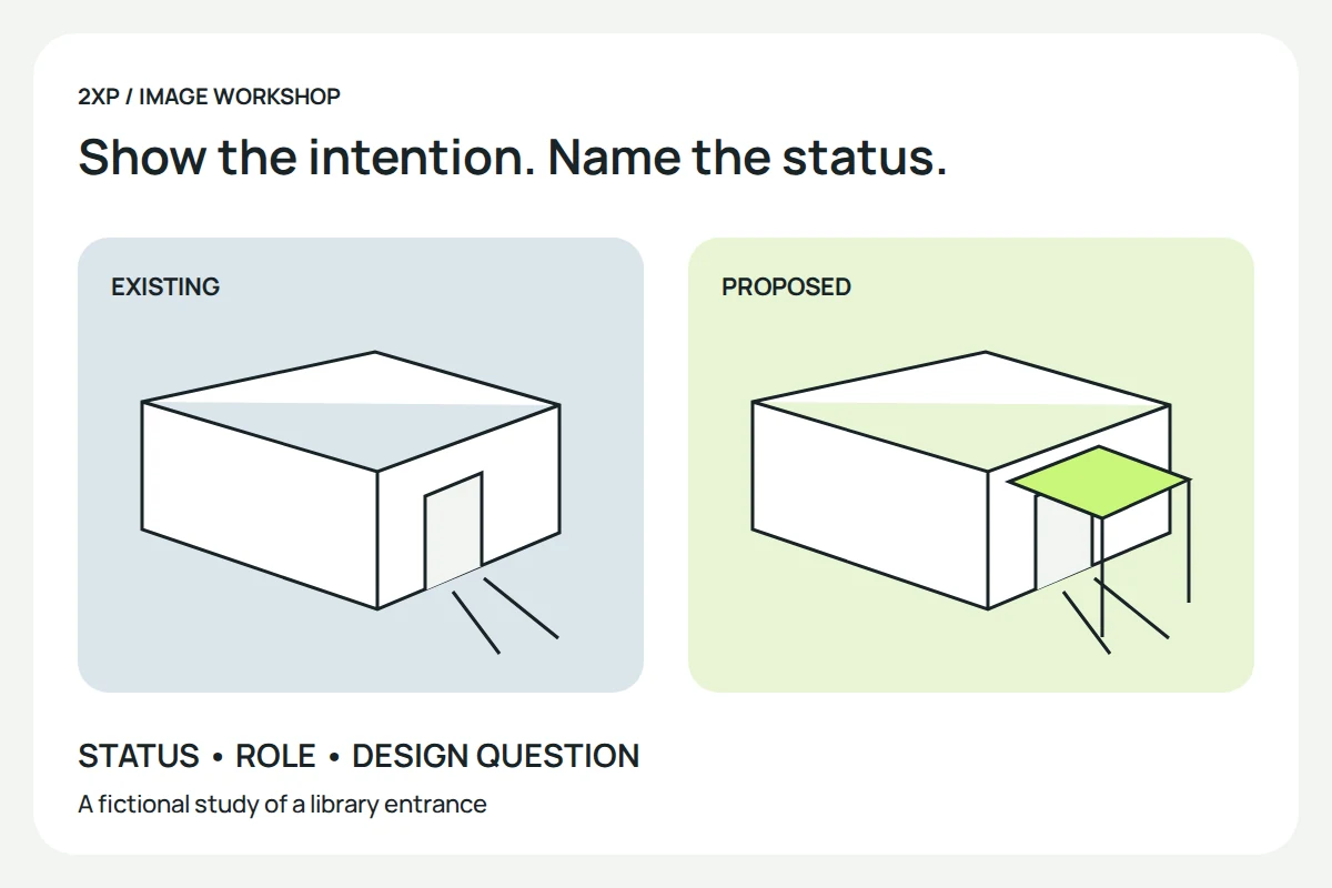
A rendering of a proposed building can explain the architect’s intention. It cannot show that the building has been completed. That distinction becomes easy to lose when a portfolio places photographs, competition entries and speculative images in the same uninterrupted grid.
Plan the presentation around what the reader needs to understand: the project’s status, the practice’s actual role and the design decision illustrated. A strong image should make that information easier to see. The example below follows an imaginary extension to a community library; no such commission or marketing experiment is claimed.
Put the project status beside the image
For the fictional library, separate a photograph of the existing entrance from a rendering of a proposed extension. A caption such as “Existing entrance, reference photograph” has a different meaning from “Proposed entrance, design study”. If the work later reaches construction, a site photograph needs its own date and description.
Photorealism is not a completion record. Keep a proposal clearly identified as a proposal, even when it appears beside photographs of completed work.
The practice’s role matters too. Designing the extension, producing a visualisation for another architect and preparing an unsolicited study are different contributions. Name the actual role rather than letting the image imply responsibility for the whole project. A clear credit is more informative than a row of unexplained client logos.
Give the presentation a design question
Suppose the library study explores whether a covered entrance could make the arrival sequence clearer. The useful set might include the existing approach, a plan indicating the proposed route and a view showing the canopy. Each image develops the same question.
The plan can explain where the route goes; the perspective can explain the spatial relationship. Neither establishes that visitors found the entrance easier to use. That would require evidence from a suitable evaluation. Describe the proposal and its reasoning without converting an intention into a measured outcome.
Context should remain checkable. Identify which neighbouring elements are based on site information and which are provisional. The guide to architectural surroundings explains why an attractive setting should not quietly alter the place the proposal occupies.
Adapt the explanation to the place it appears
A website project page can hold the full sequence, credits, status and supporting drawings. A short social post has less room, so choose one question and link to the fuller account. A newsletter can explain a particular decision to readers who already know the practice. These are proposed uses, not a ranking of channels by effectiveness.
For the library, a narrow crop of the canopy may remove the approach path that gives it meaning. Reframe the view or add a suitable diagram instead of repeating the same image everywhere. Keep the status visible in the caption even when the image travels without the surrounding project page.
At a presentation or exhibition, test whether the key relationship can be understood from the expected viewing distance. Small plan labels may need a separate enlarged detail. A talk can introduce the problem and then reveal the proposal; it does not need to rely on an unexplained loop of photorealistic views.
Make the explanation available beyond the picture
The W3C alt decision tree distinguishes informative, functional and decorative images. For an informative library view, describe the relevant meaning rather than listing every tree and cloud. A complex route diagram also needs its important information in the page text.
For example, a suitable description might identify the proposed canopy joining the path to the entrance. That description explains the visible relationship; it should not say “an accessible entrance” unless the claim is supported. The image, caption and body should make the same promise.
Give interested readers a useful next step
Someone considering a similar project may need to understand the scope of the architect’s work before making contact. Connect the case study to a real service description or an appropriate contact route. Do not use a button that promises a quotation if the destination only opens a generic gallery.
In our example, an enquiry prompt could ask the reader to describe the existing entrance and the stage of the project. The actual form and response process would need to exist before publishing that promise. This independent article does not offer architectural services or collect project enquiries.
Evaluate the response without inventing causality
Write down the intended improvement before changing the presentation: perhaps readers should be able to distinguish the existing site from the proposal and explain the purpose of the canopy. A review can check that understanding. It cannot by itself establish future enquiries or sales.
If analytics are available, record the publication date and other campaign changes before comparing results. Audience, promotion, price and the contact process may have changed too. The old claim that attractive images will reliably bring clients is not a measurement we can carry forward.
Finish the project page with the answered question, the unresolved limits and the next action that actually works. For keeping the image versions consistent across channels, use the separate campaign asset workflow.
Historical context: this article revisits the former studio’s five-channel marketing guide. Its predicted social-media percentage and guaranteed-client language are omitted. We preserve the subject while replacing those promises with a fictional project analysis and practical publication checks.